


الأكثر مبيعًا
اكتشفي اختيارات النساء العربيات منتجات حازت على ثقة الآلاف.. جربيها اليوم
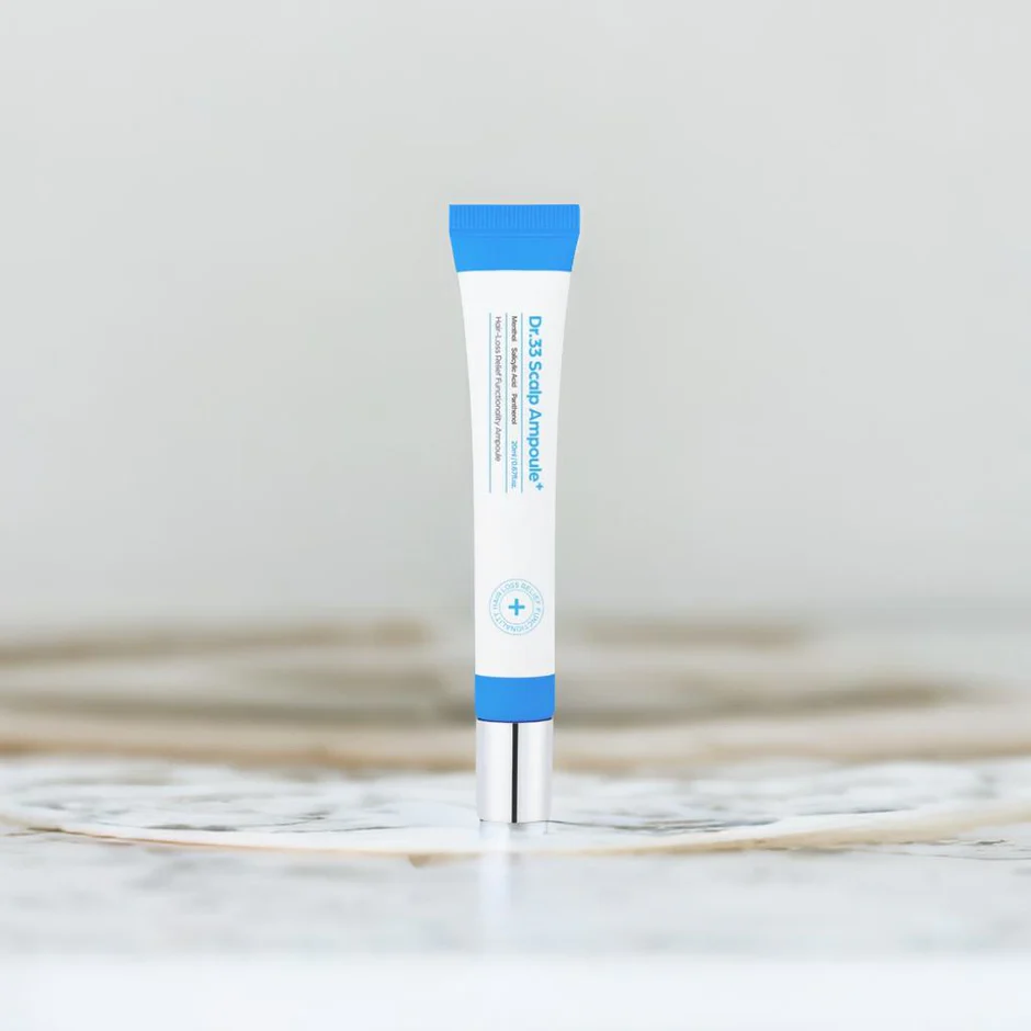
Seapuri Dr. 33 Hair Ampoule 20ml
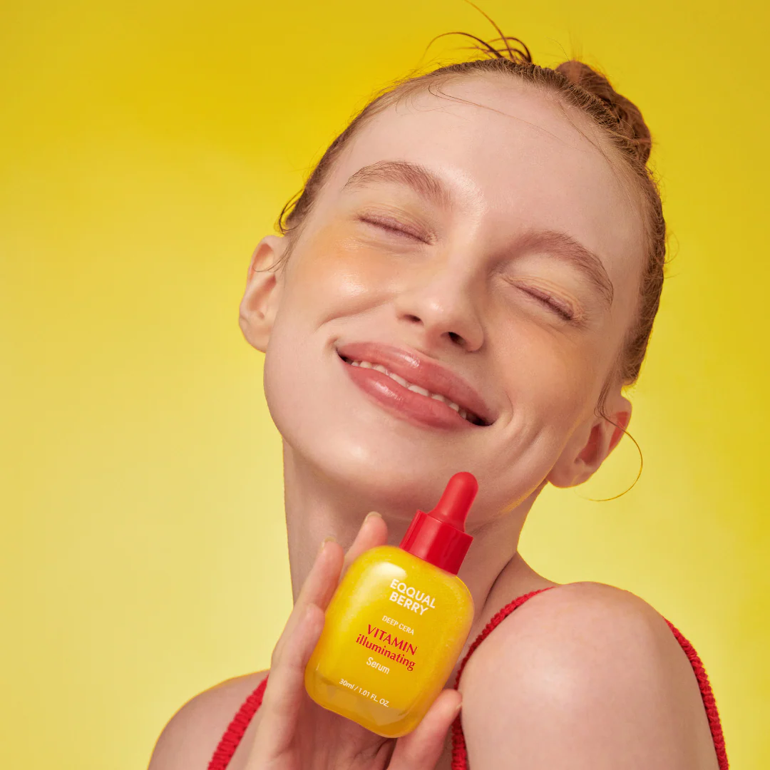
Vitamin Illuminating Serum (30ml)
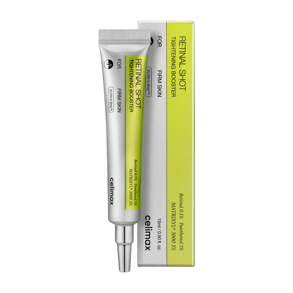
كريم الريتينال
ابر الشد التايلاندية
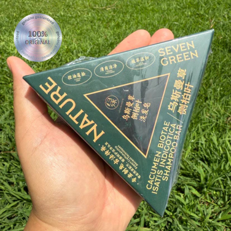
صابونة الشعر Seven Green
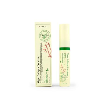
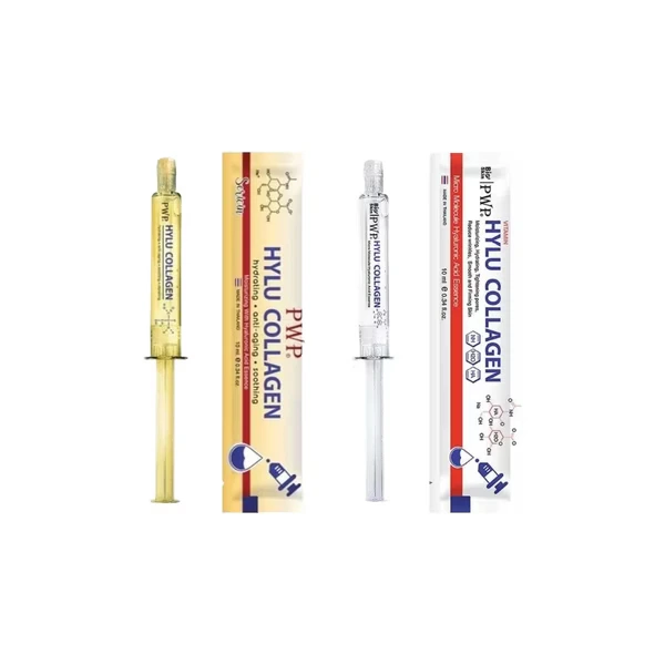
سيروم الكولاجين النباتي
* {
margin: 0;
padding: 0;
box-sizing: border-box;
font-family: 'Cairo', sans-serif;
}
:root {
--primary: #434D35;
--primary-light: #8B9D77;
--primary-dark: #2F3524;
--secondary: #C67D4B;
--accent: #D4935F;
--background: #E8E2D6;
--white: #FFFFFF;
--text-dark: #2D2D2D;
--text-light: #6B6B6B;
--shadow: 0 8px 30px rgba(67, 77, 53, 0.15);
--border: #D9D9D9;
--maron: #7A4F35;
}
body {
background-color: var(--background);
color: var(--text-dark);
background-image: url("data:image/svg+xml,%3Csvg width='60' height='60' viewBox='0 0 60 60' xmlns='http://www.w3.org/2000/svg'%3E%3Cg fill='none' fill-rule='evenodd'%3E%3Cg fill='%23434D35' fill-opacity='0.03'%3E%3Cpath d='M36 34v-4h-2v4h-4v2h4v4h2v-4h4v-2h-4zm0-30V0h-2v4h-4v2h4v4h2V6h4V4h-4zM6 34v-4H4v4H0v2h4v4h2v-4h4v-2H6zM6 4V0H4v4H0v2h4v4h2V6h4V4H6z'/%3E%3C/g%3E%3C/g%3E%3C/svg%3E");
}
.header {
background: linear-gradient(135deg, var(--white) 0%, #F5F9F4 100%);
box-shadow: var(--shadow);
position: sticky;
top: 0;
z-index: 1000;
border-bottom: 3px solid var(--primary);
}
.header-top {
background: linear-gradient(90deg, var(--primary) 0%, var(--primary-dark) 100%);
padding: 10px 0;
text-align: center;
color: var(--white);
font-size: 14px;
font-weight: 500;
}
.header-main {
max-width: 1400px;
margin: 0 auto;
padding: 20px 30px;
display: flex;
align-items: center;
justify-content: space-between;
}
.logo {
font-size: 32px;
font-weight: 800;
text-decoration: none;
}
.logo img {
height: 60px;
width: auto;
background: transparent;
}
.search-box {
flex: 1;
max-width: 500px;
margin: 0 40px;
position: relative;
}
.search-box input {
width: 100%;
padding: 14px 55px 14px 25px;
border: 2px solid var(--border);
border-radius: 30px;
font-size: 14px;
transition: all 0.3s;
background: var(--white);
}
.search-box input:focus {
outline: none;
border-color: var(--primary);
box-shadow: 0 4px 15px rgba(74, 124, 89, 0.15);
}
.search-box button {
position: absolute;
right: 6px;
top: 50%;
transform: translateY(-50%);
background: linear-gradient(135deg, var(--primary) 0%, var(--primary-dark) 100%);
color: var(--white);
border: none;
width: 42px;
height: 42px;
border-radius: 50%;
cursor: pointer;
transition: transform 0.3s;
}
.search-box button:hover {
transform: translateY(-50%) scale(1.05);
}
.header-actions {
display: flex;
align-items: center;
gap: 25px;
}
.header-actions a {
color: var(--primary);
font-size: 22px;
position: relative;
text-decoration: none;
transition: color 0.3s;
}
.header-actions a:hover {
color: var(--primary-dark);
}
.cart-count {
position: absolute;
top: -8px;
right: -8px;
background: linear-gradient(135deg, var(--secondary) 0%, var(--accent) 100%);
color: var(--white);
font-size: 11px;
width: 20px;
height: 20px;
border-radius: 50%;
display: flex;
align-items: center;
justify-content: center;
font-weight: 700;
}
.nav-menu {
background: var(--white);
border-bottom: 1px solid var(--border);
}
.nav-menu ul {
max-width: 1400px;
margin: 0 auto;
padding: 0 30px;
list-style: none;
display: flex;
gap: 35px;
}
.nav-menu a {
display: block;
padding: 18px 0;
color: var(--text-dark);
text-decoration: none;
font-weight: 600;
font-size: 15px;
transition: all 0.3s;
border-bottom: 3px solid transparent;
position: relative;
}
.nav-menu a:hover {
color: var(--primary);
border-bottom-color: var(--primary);
}
.hero {
max-width: 1400px;
margin: 40px auto;
padding: 0 30px;
}
.hero-slider {
position: relative;
border-radius: 25px;
overflow: hidden;
height: 480px;
box-shadow: var(--shadow);
}
.hero-slide {
position: absolute;
width: 100%;
height: 100%;
opacity: 0;
transition: opacity 0.8s ease;
}
.hero-slide.active {
opacity: 1;
}
.hero-slide img {
width: 100%;
height: 100%;
object-fit: cover;
}
.hero-overlay {
position: absolute;
top: 0;
left: 0;
width: 100%;
height: 100%;
background: linear-gradient(90deg, rgba(74, 124, 89, 0.85) 0%, rgba(74, 124, 89, 0.3) 100%);
}
.hero-content {
position: absolute;
top: 50%;
right: 80px;
transform: translateY(-50%);
z-index: 10;
max-width: 500px;
}
.hero-content h1 {
font-size: 52px;
font-weight: 800;
color: var(--white);
margin-bottom: 15px;
line-height: 1.2;
}
.hero-content p {
font-size: 20px;
color: rgba(255,255,255,0.9);
margin-bottom: 30px;
line-height: 1.6;
}
.hero-btn {
display: inline-block;
background: linear-gradient(135deg, var(--secondary) 0%, var(--accent) 100%);
color: var(--white);
padding: 16px 45px;
border-radius: 30px;
text-decoration: none;
font-weight: 700;
font-size: 16px;
transition: all 0.3s;
box-shadow: 0 4px 15px rgba(196, 167, 125, 0.4);
}
.hero-btn:hover {
transform: translateY(-3px);
box-shadow: 0 8px 25px rgba(196, 167, 125, 0.5);
}
.slider-dots {
position: absolute;
bottom: 25px;
left: 50%;
transform: translateX(-50%);
display: flex;
gap: 12px;
}
.slider-dot {
width: 14px;
height: 14px;
border-radius: 50%;
background: rgba(255,255,255,0.5);
cursor: pointer;
transition: all 0.3s;
border: 2px solid transparent;
}
.slider-dot.active {
background: var(--white);
transform: scale(1.2);
}
.categories {
max-width: 1400px;
margin: 60px auto;
padding: 0 30px;
}
.section-title {
text-align: center;
margin-bottom: 50px;
}
.section-title h2 {
font-size: 36px;
font-weight: 800;
color: var(--text-dark);
margin-bottom: 12px;
position: relative;
display: inline-block;
}
.section-title h2::after {
content: '';
position: absolute;
bottom: -8px;
left: 50%;
transform: translateX(-50%);
width: 60px;
height: 4px;
background: linear-gradient(90deg, var(--primary) 0%, var(--accent) 100%);
border-radius: 2px;
}
.section-title p {
color: var(--text-light);
font-size: 17px;
margin-top: 15px;
}
.categories-grid {
display: grid;
grid-template-columns: repeat(4, 1fr);
gap: 25px;
}
.category-card {
background: var(--white);
border-radius: 20px;
padding: 35px 25px;
text-align: center;
box-shadow: var(--shadow);
transition: all 0.4s;
cursor: pointer;
text-decoration: none;
color: inherit;
border: 2px solid transparent;
}
.category-card:hover {
transform: translateY(-10px);
border-color: var(--primary);
box-shadow: 0 15px 40px rgba(74, 124, 89, 0.2);
}
.category-card i {
font-size: 45px;
color: var(--primary);
margin-bottom: 18px;
transition: transform 0.3s;
}
.category-card:hover i {
transform: scale(1.1);
}
.category-card h3 {
font-size: 18px;
font-weight: 700;
color: var(--text-dark);
}
.products {
max-width: 1400px;
margin: 60px auto;
padding: 0 30px;
}
.products-grid {
display: grid;
grid-template-columns: repeat(3, 1fr);
gap: 30px;
}
.product-card {
background: var(--white);
border-radius: 20px;
overflow: hidden;
box-shadow: var(--shadow);
transition: all 0.4s;
text-decoration: none;
color: inherit;
border: 2px solid var(--border);
display: flex;
flex-direction: column;
}
.product-card:hover {
transform: translateY(-12px);
border-color: var(--primary);
box-shadow: 0 20px 50px rgba(74, 124, 89, 0.25);
}
.product-image {
position: relative;
height: 500px;
overflow: hidden;
background: linear-gradient(135deg, #f5f9f4 0%, #ffffff 100%);
display: flex;
align-items: center;
justify-content: center;
padding: 15px;
border-radius: 20px 20px 0 0;
}
.product-image img {
width: auto;
height: auto;
max-width: 100%;
max-height: 480px;
object-fit: contain;
border-radius: 15px;
}
.product-badge {
position: absolute;
top: 15px;
right: 15px;
background: linear-gradient(135deg, var(--secondary) 0%, var(--accent) 100%);
color: var(--white);
padding: 6px 15px;
border-radius: 20px;
font-size: 12px;
font-weight: 700;
box-shadow: 0 3px 10px rgba(196, 167, 125, 0.4);
}
.product-info {
padding: 22px;
flex: 1;
display: flex;
flex-direction: column;
}
.product-category {
font-size: 13px;
color: var(--primary);
font-weight: 600;
margin-bottom: 8px;
text-transform: uppercase;
letter-spacing: 1px;
}
.product-name {
font-size: 17px;
font-weight: 700;
margin-bottom: 12px;
line-height: 1.4;
color: var(--text-dark);
}
.product-rating {
display: flex;
align-items: center;
gap: 5px;
margin-bottom: 15px;
}
.product-rating i {
color: var(--accent);
font-size: 13px;
}
.product-rating span {
font-size: 12px;
color: var(--text-light);
margin-right: 5px;
}
.product-price {
display: flex;
align-items: center;
justify-content: space-between;
margin-top: auto;
gap: 10px;
}
.price-wrapper {
display: flex;
flex-direction: column;
gap: 4px;
}
.price {
font-size: 22px;
font-weight: 800;
color: var(--primary);
}
.old-price {
font-size: 14px;
font-weight: 500;
color: #dc3545;
text-decoration: line-through;
}
.add-cart {
background: linear-gradient(135deg, var(--secondary) 0%, var(--accent) 100%);
color: var(--white);
padding: 10px 20px;
border-radius: 25px;
display: flex;
align-items: center;
justify-content: center;
border: none;
cursor: pointer;
transition: all 0.3s;
box-shadow: 0 4px 15px rgba(198, 125, 75, 0.4);
font-family: 'Cairo', sans-serif;
font-size: 13px;
font-weight: 600;
}
.order-btn {
width: 100%;
background: linear-gradient(135deg, var(--secondary) 0%, var(--accent) 100%);
color: var(--white);
border: none;
padding: 14px;
border-radius: 12px;
font-size: 15px;
font-weight: 700;
cursor: pointer;
margin-top: 12px;
transition: all 0.3s;
font-family: 'Cairo', sans-serif;
}
.order-btn:hover {
transform: translateY(-2px);
box-shadow: 0 6px 20px rgba(198, 125, 75, 0.4);
}
.features {
background: linear-gradient(135deg, var(--primary) 0%, var(--primary-dark) 100%);
padding: 70px 30px;
margin-top: 100px;
position: relative;
overflow: hidden;
}
.features::before {
content: '';
position: absolute;
top: -50%;
left: -50%;
width: 200%;
height: 200%;
background: url("data:image/svg+xml,%3Csvg width='60' height='60' viewBox='0 0 60 60' xmlns='http://www.w3.org/2000/svg'%3E%3Cg fill='none' fill-rule='evenodd'%3E%3Cg fill='%23ffffff' fill-opacity='0.05'%3E%3Cpath d='M36 34v-4h-2v4h-4v2h4v4h2v-4h4v-2h-4zm0-30V0h-2v4h-4v2h4v4h2V6h4V4h-4zM6 34v-4H4v4H0v2h4v4h2v-4h4v-2H6zM6 4V0H4v4H0v2h4v4h2V6h4V4H6z'/%3E%3C/g%3E%3C/g%3E%3C/svg%3E");
animation: float 20s linear infinite;
}
@keyframes float {
0% { transform: translateY(0); }
100% { transform: translateY(50px); }
}
.features-grid {
max-width: 1400px;
margin: 0 auto;
display: grid;
grid-template-columns: repeat(4, 1fr);
gap: 40px;
position: relative;
z-index: 1;
}
.feature-item {
text-align: center;
color: var(--white);
padding: 20px;
}
.feature-item i {
font-size: 48px;
margin-bottom: 20px;
display: inline-block;
background: rgba(255,255,255,0.15);
width: 90px;
height: 90px;
line-height: 90px;
border-radius: 50%;
}
.feature-item h4 {
font-size: 20px;
font-weight: 700;
margin-bottom: 10px;
}
.feature-item p {
font-size: 14px;
opacity: 0.9;
line-height: 1.6;
}
.footer {
background: #d3d8c9;
color: #2D2D2D;
padding: 70px 30px 30px;
}
.footer-grid {
max-width: 1400px;
margin: 0 auto;
display: grid;
grid-template-columns: 2fr 1fr 1fr 1fr;
gap: 50px;
}
.footer-brand h3 {
font-size: 32px;
font-weight: 800;
background: linear-gradient(135deg, var(--primary-light) 0%, var(--accent) 100%);
-webkit-background-clip: text;
-webkit-text-fill-color: transparent;
background-clip: text;
margin-bottom: 18px;
}
.footer-brand p {
color: #a8b8a8;
line-height: 1.8;
margin-bottom: 22px;
}
.social-links {
display: flex;
gap: 15px;
}
.social-links a {
width: 45px;
height: 45px;
background: linear-gradient(135deg, var(--primary) 0%, var(--primary-dark) 100%);
color: var(--white);
border-radius: 50%;
display: flex;
align-items: center;
justify-content: center;
text-decoration: none;
transition: all 0.3s;
font-size: 18px;
}
.social-links a:hover {
transform: translateY(-5px);
background: linear-gradient(135deg, var(--secondary) 0%, var(--accent) 100%);
}
.footer-column h4 {
font-size: 18px;
font-weight: 700;
margin-bottom: 22px;
color: var(--accent);
}
.footer-column ul {
list-style: none;
}
.footer-column li {
margin-bottom: 14px;
}
.footer-column a {
color: #a8b8a8;
text-decoration: none;
transition: all 0.3s;
display: inline-block;
}
.footer-column a:hover {
color: var(--white);
transform: translateX(5px);
}
.footer-bottom {
max-width: 1400px;
margin: 45px auto 0;
padding-top: 30px;
border-top: 1px solid rgba(255,255,255,0.1);
text-align: center;
color: #6b7b6b;
font-size: 14px;
}
@media (max-width: 1024px) {
.categories-grid,
.products-grid {
grid-template-columns: repeat(3, 1fr);
}
}
@media (max-width: 768px) {
.header-main {
flex-wrap: wrap;
gap: 15px;
}
.search-box {
order: 3;
max-width: 100%;
margin: 10px 0 0;
}
.nav-menu ul {
overflow-x: auto;
white-space: nowrap;
padding: 0 15px;
}
.hero-slider {
height: 350px;
}
.hero-content h1 {
font-size: 32px;
}
.hero-content {
right: 30px;
max-width: 300px;
}
.categories-grid,
.products-grid {
grid-template-columns: repeat(2, 1fr);
}
.features-grid {
grid-template-columns: repeat(2, 1fr);
}
.footer-grid {
grid-template-columns: repeat(2, 1fr);
}
}
@media (max-width: 480px) {
.categories-grid,
.products-grid,
.features-grid {
grid-template-columns: 1fr;
}
.footer-grid {
grid-template-columns: 1fr;
}
.hero-content {
right: 20px;
left: 20px;
}
}